How to check how responsive a website template is
Have you ever created a website template but want to see if it looks good or not on multiple different devices that don’t all have? Don’t worry, there are websites that offer such features and they are very easy to use. If you maybe want to see what it looks like in the form of pictures, you can use the website’s screenshot generator. But it’s different if you want to see what it looks like right away clickable links, images, etc. like in an emulator, and if with a screenshot (picture) it can only be seen.
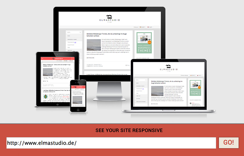
The website I’m going to share is called “Am I Responsive Design?The website is very popular because of its features that can perfectly display the website on different devices. So by using the website you can already see the appearance of your website on the Internet Desktop, laptop, tablet and mobile device (SmartPhone) directly or by design not in picture form. The website uses an HTML iframe tag so that the entire website can be displayed except for the website which is displayed with the javascript frame breaker.
For the procedure, please go to first http://ami.responsivedesign.is and enter the url of the website you want to view, then hit GO and see the results. If at any point you don’t see anything after clicking GO, just reload the page and see the results.
Now you don’t have to be confused to see the results of the template you want to apply across multiple different devices. On the website Am I Responsive Design? it also makes it easy to view any website with a single click. Namely with this URL. http://ami.responsivedesign.is/?url=http: // URLWebsite. Please replace the blue URL with the website URL shown.
If you have any questions about any of the above, please comment. 
Hopefully useful and good luck